Case study · Brand & Web Design
Inês Santos Coaching
A rebrand and bilingual WordPress rebuild for a life coach whose clients live with anxiety and stalled goals: a site that shows her method and sends each visitor to the path that fits their struggle.
The problem
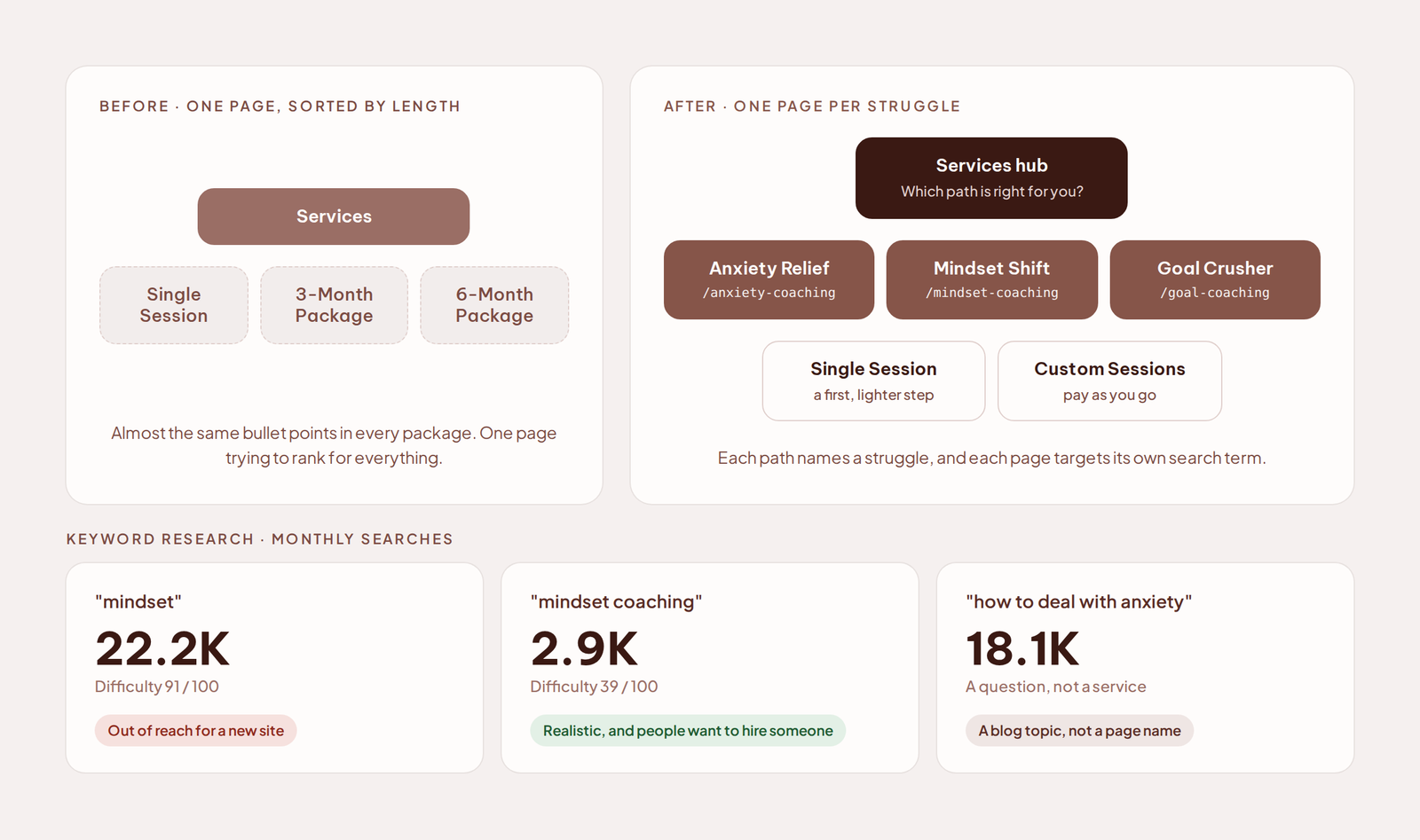
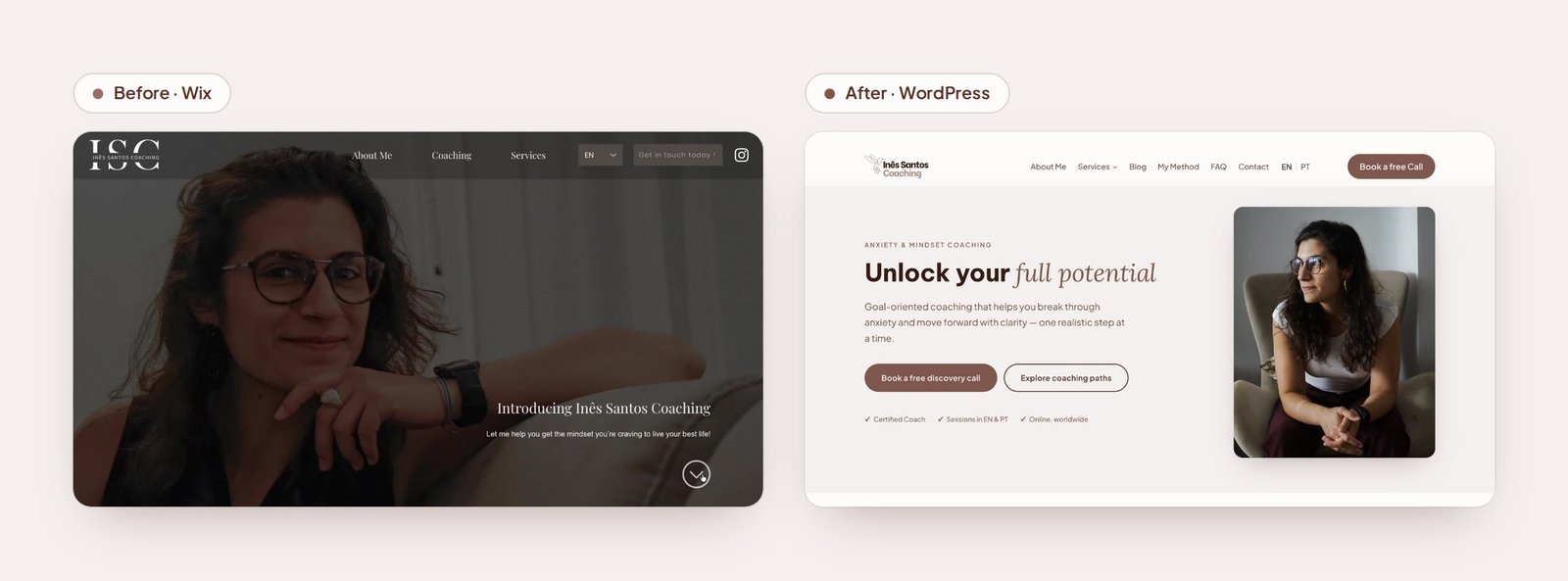
Inês’s Wix site from 2022 introduced a coach, but it did not help an anxious visitor decide anything. The method was invisible, and the services were sorted by length, with almost the same bullet points. Nobody could tell which one was meant for them.
What I did
Strategy and positioning, a rebrand, UX and web design, accessibility, and the WordPress build itself, in English and Portuguese. Solo, end to end. I made every design call; Claude helped me write and check the code faster.
The key decision
Services rebuilt around real struggles instead of session counts: Anxiety Relief, Mindset Shift and Goal Crusher, each with its own page and its own search term. A visitor now recognises their own problem in the name before reading a single description.
The outcome
A responsive site, live since August 2026 on desktop and mobile, in English and Portuguese. One generic “get in touch” button became clear coaching paths and one consistent CTA: a free discovery call. Contrast and tap targets pass WCAG 2.2 AA, every real page is indexed by Google, and Inês now owns a brand system, a blog and a lead magnet built to bring her more visits and more clients.
Before
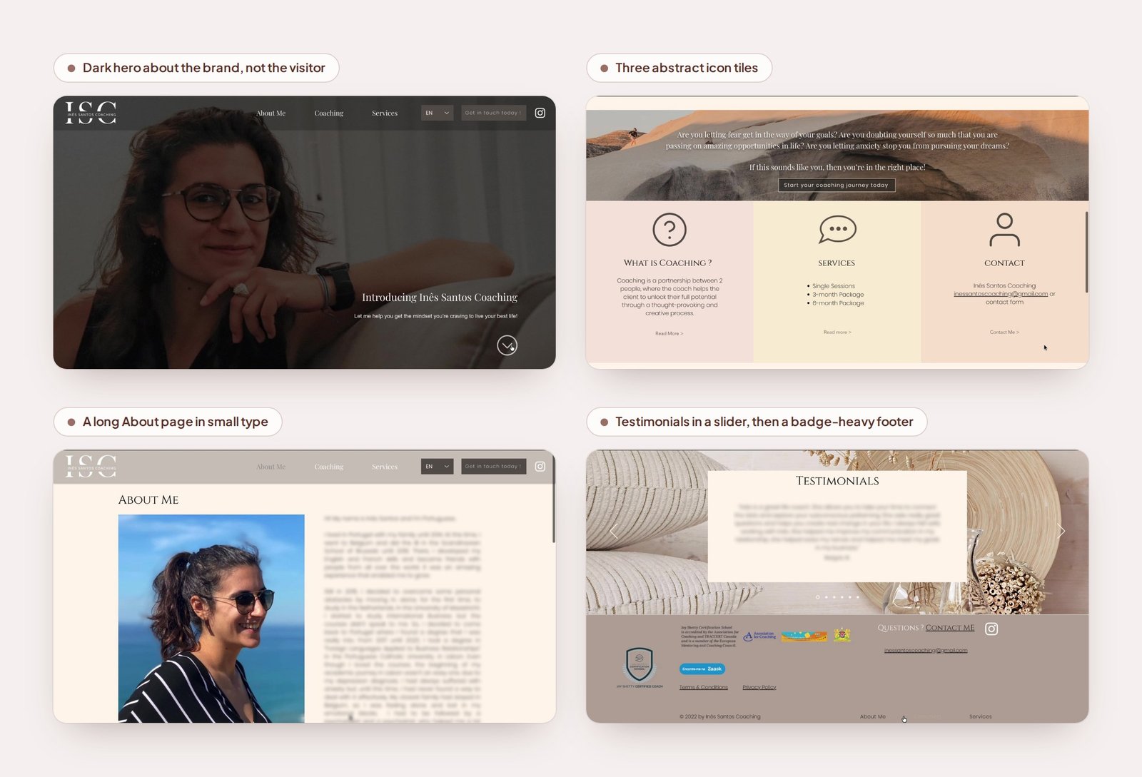
The old site talked about the brand, not the visitor, and long text with little hierarchy left a nervous client without answers.
The question for the project: how might we help an anxious visitor feel understood within seconds, see how coaching with Inês works, and know what to do next, without adding pressure?
Strategy: who is this for?
Beyond a fresh look, Inês had two goals: more visits to her site and more clients. Before designing anything, I wrote a strategy proposal and went through it with her. It defined the audience: people aged 20 to 40 who struggle with anxiety, overthinking or self-doubt. It gave them a face, Sofia, 23, thoughtful and ambitious but often overwhelmed, who trusts a coach who explains the process. And it set the positioning: supportive coaching with structure and direction, not vague motivation.
Two recommendations shaped the whole site: make the method visible, and give people clear paths based on what they are struggling with.
Services, rebuilt around real struggles
Instead of three packages sorted by length, I worked with Inês to build the services around the problems her clients actually bring: Anxiety Relief, Mindset Shift and Goal Crusher, plus Single and Custom Sessions as lighter ways in.
Named for search, too. Broad terms were out of reach for a new site: “mindset” has about 22,200 monthly searches but a difficulty score of 91 out of 100. “Mindset coaching” is smaller, about 2,900 searches, but scores 39, and many of the people searching it want to hire someone. So each path got its own page, with the matching coaching term in its title and address: /anxiety-coaching, /mindset-coaching, /goal-coaching. Question searches such as “how to deal with anxiety”, about 18,100 a month, became blog topics instead.
Rebrand
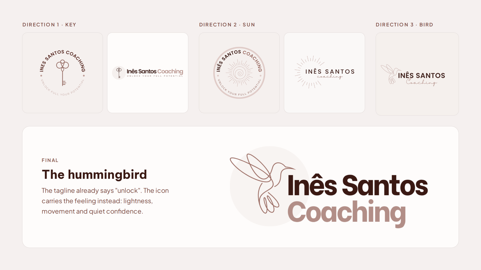
I designed a warm brown palette and three logo directions: a key, a sun and a bird. The key matched her tagline, “Unlock your full potential”, but only repeated what the words already said. I recommended the hummingbird: the tagline explains the promise, so the icon can carry the feeling behind it. Lightness, movement and quiet confidence are what an anxious visitor needs to land on. Inês agreed.
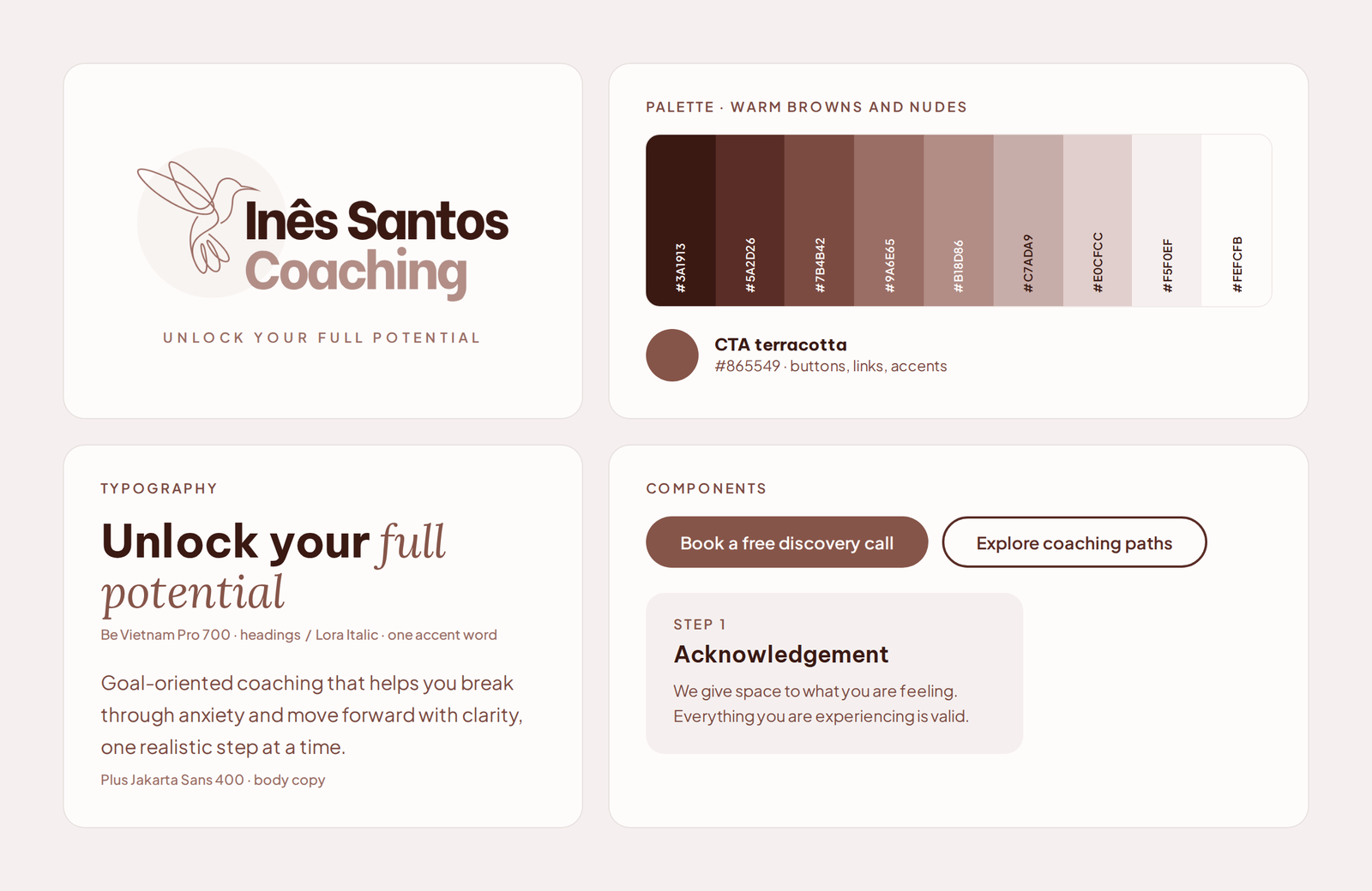
Around the logo I built a small system: nine warm browns plus one terracotta for calls to action, Be Vietnam Pro for headings, Plus Jakarta Sans for body text, and one set of buttons and cards used everywhere.
Visual design and UX principles
The old site mixed a dark hero, pastel tiles, stock photos and small serif capitals. The new UI is “a digital breath of fresh air”: a light, warm base, one accent colour kept for actions, a real photo of Inês, and one repeating pattern of label, heading, intro and cards. The homepage answers three questions in order: is this for me, how does it work, and what do I do next?
Make the process visible. A five-step method on the homepage, from Acknowledgement to Evaluation.
Respect attention. A free PDF offered after 20 seconds, hidden once closed, and a small banner on phones instead of a full-screen popup.
Accessibility (WCAG 2.2 AA)
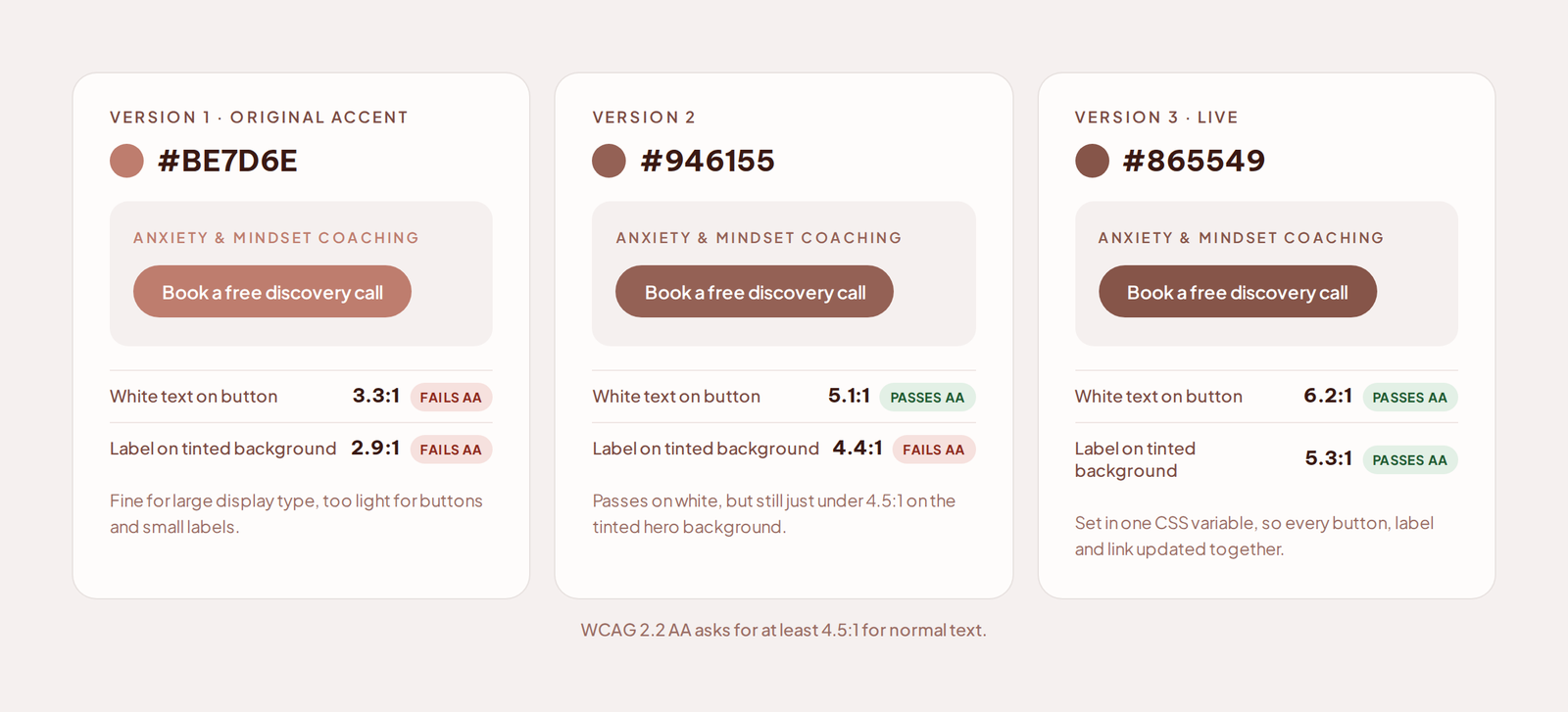
For an audience that often arrives anxious, friction is not a small detail. Contrast: the original terracotta gave white button text only 3.3:1, so I darkened it in two steps to 6.2:1, in one CSS variable, so every button and link changed together.
Tap targets: the EN and PT links on phones measured 31 by 19 pixels with no gap before the menu button; they now measure at least 37 by 44, with an 8px gap. Keyboard and screen readers: the popup keeps focus inside, closes with Esc, and its icon buttons have text labels. Two bugs only appeared on a real iPhone; I now test the real device first.
Launch and growth
The Portuguese site went live on 9 September, all 11 pages with a simple EN | PT switcher. The blog has four articles, plus a template and a short guide so Inês can post on her own. A free “5-Minute Daily Reset” PDF is offered through the popup and the footer. Google was still reading the old Wix sitemap; after I submitted the new one, every real page of the site is now indexed.
The site has only been live since August, so rather than guess at numbers, we measure the two goals directly: visits and search clicks per coaching path, and discovery call requests and email sign-ups as the path to new clients.
Reflection
The hardest part was holding back on the design until the strategy was clear. The decisions I am proudest of, the hummingbird, the struggle-based paths and the visible method, came from that document rather than from taste. And a client who is not a designer needs reasons, not options: explaining each decision in plain language is what let Inês say yes with confidence.
Want the full process?
The complete case study lives on Notion: strategy, keyword research, brand system and every design decision.